
It can simply no longer be denied by any right-wingers that Reform’s polling peak has been and gone – and the party are very much on the slide now.
Anyone who’s been following the polls over the last couple of months will have noticed a trend across the broad: Reform are losing support.
After months at the top of pretty much every poll, their once-commanding lead has vanished in recent weeks.
Whether this is because of an ever-growing list of controversies, increased levels of scrutiny, their Trump-fawning or a the emergence of Restore Britain is difficult to tell at this stage. It may likely be a combination of all of these factors.
But some in the Reform camp have refused to accept their shedding support, pointing to other polls where they’ve gained support slightly or seen their polling lead stay the same.
Now though, a visual summary of polling data has gone viral which undeniably shows that the Reform polling slide is no coping mechanism from the left or figment of their imagination.
It’s very, very real.
READ NEXT: Senior candidate QUITS Reform, citing ‘too many Tories’ in the party
The graph in question can be found on the Wikipedia page which collates all opinion polling for the next UK general election.
In a useful chart plotting the results for each party, a trend line is also given.
Take a look for yourselves below.
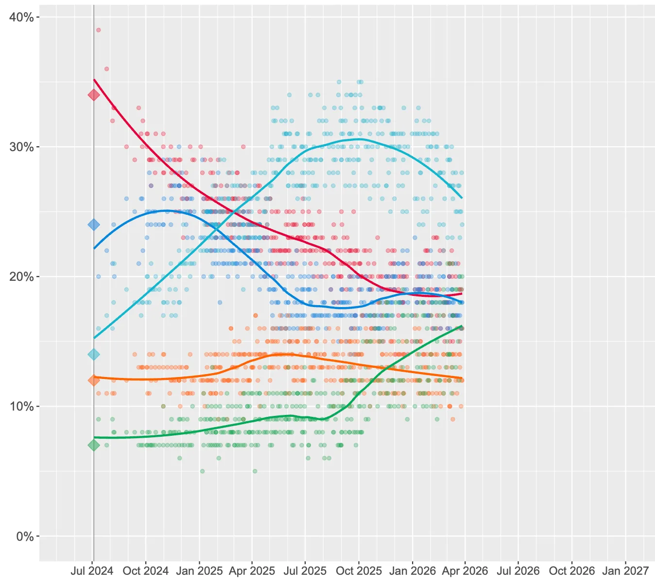
It looks like Reform’s peak of polling in the 30s is a thing of the past.
The graph was shared by one account on X who said Reform were “sliding big time” in the polls.
Some said the data was the final proof that the Reform slide was an undeniable trend.
And others pointed out that another party had done the exact opposite of Reform, almost perfectly mirroring the slide with their own rise…