With the current season arguably the most anticipated in decades, European football clubs are responsible for some excellent football shirts this year.
Several are inspired by either high fashion or a bygone (significantly better) era, with others paying tribute to music icons in a spectacular way.
As such, here’s our run-down of the 2021/22 season’s best football shirts sported by European clubs.
The new SSC Napoli shirt isn’t necessarily the team’s greatest of all time, but features a historic collaboration between the team and Giorgio Armani. The first football shirt ever designed by Giorgio Armani, the new kits are emblazoned with the Emporio Armani “EA7” logo. It’s calm, understated and classy, in true Italian style. The third shirt is also yet to be unveiled, but potential leaks suggest it’s even better than the home strip.
RB Leipzig may be Germany’s most hated team, but their third kits are consistently outstanding. With a fractured stripe pattern not too dissimilar to the new home and away shirts, the 21/22 season’s third shirt has an eye catching colourway with “midnight navy”, “hyper pink” and turquoise as a backdrop for the white badge and Red Bull logo.
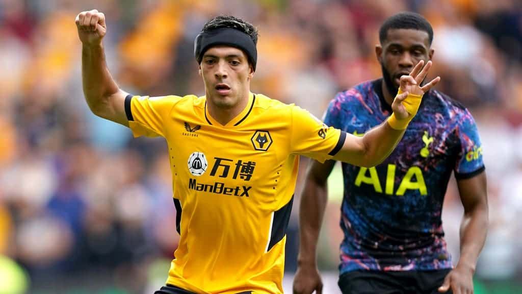
With a pattern designed to mirror the team’s “modern and aggressive” playing style, the new Wolverhampton Wanderers Castore away kit is the team’s best in years. With tonal greys and blacks flecked with gold accents, it’s a razor sharp kit from the most understated UK team in the pack.
While the home kit is unremarkable, Tottenham Hotspur’s new away and third kits are both incredible. The third strip has a purple (“wild berry”), white and black colourway with “bold prints and patterns inspired by the streets of Tottenham”, though the away kit edges it slightly with its loud neon logos against a black base. Hate it or love it, it’s got huge cult status potential, and for good reason.
They may have lost Lionel Messi, but FC Barcelona’s new third kit is a winner. Although the use of the exact same colours of the home shirt is somewhat unorthodox, the signature red and blue stripes are embellished with a fresh design. Specifically, it’s described as “a representation of neighbourhoods reimagined by talented young artists”, celebrating the city’s architectural highlights and various regions.
It’s fair to say that Arsenal’s 2021/22 kits are far better than the team’s performance thus far. While navy motifs have returned to the home kit, the third kit is particularly striking. 25 years on, it’s evocative of the 95/96 lightning strip: modern but also reminiscent of Adidas kits from the late ‘80s and early ‘90s.
Liverpool’s new away kit has been designed as an homage to the fan favourite 96/97 jersey, widely regarded as one of the club’s best. Dark green and crimson accents join a “stone white” base inspired by the “Three Graces” – a trio of buildings on Liverpool’s waterfront. The new third shirt is also particularly of note with its vivid yellow and red colourway with checkerboard accents.
Inter Milan’s new kits for the 21/22 season have divided fans by deviating from tradition. While the home shirt has a black and blue Biscione snakeskin look not seen for a decade, the away shirt has a bold, unusual design featuring a coiling blue and black snake on a white background. What else did you expect from the fashion capital of the world?
Having adopted Bob Marley’s ‘Three Little Birds’ as their unofficial anthem for home matches, Ajax’s new third kit pays homage to the reggae icon. Remarkable in its simplicity, the new shirt has a black base and accents in red, yellow and green, including shoulder stripes and sleeve cuffs, plus three embroidered birds which have since been removed from the shirts for going against UEFA regulations.
Having ended their relationship with Nike, Venezia FC’s move to Kappa has paid off with this season’s home kit. Designed in collaboration with New York-based Fly Nowhere, the stand-out kit draws on traditional Venetian details and iconography with a printed trompe l’oeil Venetian wall texture on its black base alongside pops of gold, orange and green. After almost two decades, the team will compete in their first top flight campaign while looking absolutely impeccable.
Related: Calls for independent financial regulator after Derby call in administrators