
It seems like logo redesign is very popular in 2016, especially for some of the world’s biggest and most popular brands. Rebranding can often negatively affect a product, especially if their consumers have grown to love their logo design.
But change can also be a good thing and it seems like brands are willing to modernise their look for the digital age, that is 2016. Let’s have a look at a variety of businesses who have amped up their logo game.
Instagram Pictures a Future in Colour
The biggest rebrand of 2016 has to be by Instagram and whether you like their new design or not it seems like Instagram’s colourful new design is here to stay. On their website the social media company announced their reason for changing their much loved camera icon.

“The Instagram community has evolved over the past five years from a place to share filtered photos to so much more — a global community of interests sharing more than 80 million photos and videos every day. Our updated look reflects how vibrant and diverse your storytelling has become.”
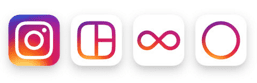
As well as changing their main Instagram logo, the company’s went all out adding the branding to their sister apps; Boomerang, Hyperlapse and Layout. Already their logos were much fresher looking than the old main one, which was perhaps the reason why Instagram decided to update their original logo.
Instagram didn’t stop at logo design; they have also made changes to the in-app UI. The design is much more “flatter” and some of the colours have been changed. The apps Fonts are now black in colour, and notifications have changed to orange rather than red. Instagram said that the update will benefit users as it “puts more focus on your photos and videos without changing how you navigate the app.”
Guinness: Sharp New Harp
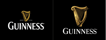
Guinness will soon be introducing a revised logo, designed by London-based Design Bridge. Design Bridge collaborated on this project with artisan letterpress print studio, New North Press.
Design Bridge wanted to enhance an already effect logo. To do this they wanted to dramatise the harp which features on the logo. Design Bridge have created something which stands out and immediately creates a much grander impression.
How did they create this new look? Design Bridge spent time separating the harp illustration out into a series of layers, they also experimented with letterpress techniques, overlaying, textures and embossing techniques.
The final design really brings Guinness into 2016 as the logo captures the depth of the brand whilst keeping true to their traditional design.
Netflix Fans Aren’t Chill
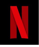 This week Netflix have added a new icon to their branding and it seems like they have learned from Instagram’s mistakes. The official Netflix Twitter Account has responded to a worried fan with regards to the brands new addition:
“Not a new logo! The N is an icon and a new creative element to live with our logo. The current Netflix logo is here to stay”
Fans of the streaming service have confused their new icon for a revised logo. The folded “N” emblem has appeared on the company’s Facebook and Twitter profile photos. The new design is definitely something different for the brand and it is much more artisan than their previous flat logo.
Repeat Logo, who create company logos are inspired by Netflix’s change in direction: “This is a great time for Netflix to change up their logo design as they are more popular than ever! Netflix are representing their diversity and status in the media world by launching an icon which is simply just the first letter of their brand. They have lost the excess lettering because they now do not need it.”
Budweiser Bottle Up the Courage for Change
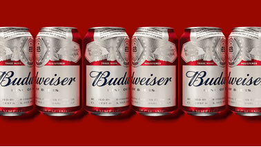
At the very start of 2016, there was lots of hype surrounding the change in the Budweiser design. A team of almost 30 people worked on this new design. The goal was to create a look and feel which represented the work that goes into the beer’s brewing and Budweiser’s rich experiences 140-years. Creative director at Jones Knowles Ritchie, Tosh Hall, was a major part of the brands redesign:
“Even though it’s an iconic beer, the iconography at that time didn’t represent the heritage of the beer…[Now] it’s an amalgamation of the best parts of the last 140 years of Budweiser.”
Although the brand has completely changed the look of their products they have still incorporated the most memorable parts from the older design. The new look gives the brand a fresh identity that still appreciates the brand’s past. Budweiser’s legacy includes the bow tie, the inescapable red colouring and the classic font.
Craft beers are more popular than ever and of course Budweiser is honing in on this. Although Budweiser already have a massive following it wouldn’t hurt them to attract consumers’ while craft beer is so desirable. According to Brewers Association data, the production of American craft beer rose 16% in the first half of 2015.
The question is, will Budweiser loyalists like the change in design? When Tropicana rebranded back in 2009, things didn’t go as planned for the fruit juice company. It seemed like orange juice fans alike were not impressed with the original logo being taken away and their sales began to sink by an incredible 20%!
Thinking About a New Logo Design?
If you are considering a change in logo direction, tread carefully before you make a decision that you could regret.
Ian Spalter, Instagram’s head of design, wrote in a blog post on Medium that: “brands, logos, and products develop deep connections and associations with people, so you don’t just want to change them for the sake of novelty”.
Instagram and Netflix are brands that whether they change their logo or not, consumers will still engage with their product. Still it is always nice to keep branding and logo design fresh, even if it means making the slightest of changes to your current style. As for Budweiser only time will tell if customers will buy into their new branding, craft beer is more popular than ever and this trend will definitely be keeping the Budweiser design team on their toes.