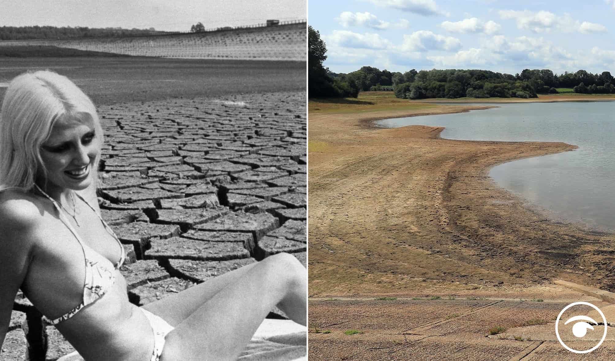
The heatwave that hit the UK in the summer of 1976 was one of the longest in living memory and triggered the most significant drought for at least the last 150 years.
In 1976, there were 15 consecutive days when temperatures reached 32C (89.6F) or higher somewhere in the UK, according to the Met Office.
That year was also marked by standpipes in the streets, water rationing and the appointment of a Minster for Drought.
So there was no doubt it was hot, very hot.
But is the current heatwave similar to 1976 or is this something more concerning?
A health boss has warned the forecast for high temperatures could result in people dying while Deputy Prime Minister Dominic Raab said people should be resilient enough to “enjoy the sunshine”.
College of Paramedics chief executive Tracy Nicholls said the “ferocious heat” the UK is predicted to experience over the next few days could have a detrimental effect on Britons.
Scorching temperatures are predicted for Monday, with Peterborough expected to hit 37C and Milton Keynes, Norwich and Lincoln set to hit 36C – while temperatures could hit 40C in London on Tuesday.
Climate attribution scientist at the Met Office, Dr Nikos Christidis, has said the 40C prediction is a result of climate change.
So with the concern about climate change in mind, Kevin Pluck shared a graphic on Twitter that compares the two heat maps of the world, and as you can see it looks a lot worse now than it did back in that scorching summer in the 70s.
He also followed up with a thread explainer:
1.
2.
3.
4.
People were shocked by the comparison:
1.
2.
3.
4.
5.
6.
7.
8.
Related: Watch: Raab says we should be enjoying the sun as temps could reach 40c and people aren’t having it