By Joe Mellor, Deputy Editor
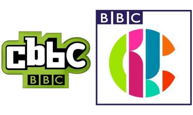
The BBC has unveiled a new CBBC logo and its controller admitted it “doesn’t scream ‘children’s TV’”. CBBC was given its first makeover for nine years on Monday, replacing the familiar green and black logo introduced in 2007.
Additionally, the new look for BBC3 doesn’t actually say BBC3 and neither does the new-look CBBC logo.
New BBC3 logo
CBBC controller Cheryl Taylor said: “Our new logo is not overt, it doesn’t scream ‘children’s TV’ but its various iterations are fun and unpredictable and have broad appeal.”
Taylor said the new look was a “colourful and versatile identity that is box fresh and fit for purpose in a mercurial and constantly shifting media landscape” and a “badge of quality that our older viewers can appreciate as much as younger ones”.
“Our old logo just wasn’t devised to perform in a variety of digital spaces which means that it doesn’t work in the way that we want it to today,” she said.
Have a look at the new and old logos next to each other and make up your own mind.
Old logo left, new logo on right
